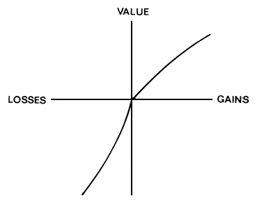
One of the most famous figures in psychology is the following:


This is the famous utility curve that helped Daniel Kahneman win the Nobel Prize. To understand just what a big deal this is, psychologists very rarely win the Nobel Prize because there is no Nobel Prize for psychology (he won for economics).
Here's how to understand the figure. On the X axis is objective gains and losses (for sake of simplicity, assume what we are gaining and losing is money). On the Y axis is subjective utility -- how much you like the gain or dislike the loss.
The striking thing is that the line is not straight. The idea is that the difference between winning $5 and winning $15 is greater than the difference between winning $1005 and $1015. The same goes for losses -- losing $5 is annoying, but losing an extra $5 on top of a loss of $1000 is just a drop in the bucket. This explains, among things, why people will spend an extra $5 on a car or a house but not on a stick of gum (a strange finding, when you think about it, since $5 is $5 either way).
These curves also predict something very interesting. Suppose you had a 50% chance of winning $10 and a 50% chance of winning nothing or you could take a guaranteed $5. Which would you do? Most people go with the guaranteed bet. This makes no sense according to probability theory, since your expected win is $5 either way, but it does when you look at the graph. The average subjective value of $10 and $0 is actually less than the subjective value of $5. Thus the best bet in terms of subjective value is the sure-thing $5.
With losses, you see something different. Suppose you had a 50% chance of losing $10 and a 50% chance of losing $0 or a guaranteed loss of $5. Most people would take their chances on the coin flip rather than going with the guaranteed loss. This again makes no sense if you look at the monetary values -- it's $5 on average either way. However, the average subjective pain of losing $10 and losing nothing is actually less than the subjective pain of losing $5. So the best bet in terms of the subjective value of the losses is to go with the coin flip.
This graph also shows that losses loom larger than gains, but I leave it to the reader to work this out for themselves. Altogether, these few squiggles pack in a lot of information.


No comments:
Post a Comment